David Fernandez 🤙🏾
Creative Lead
Better ideas.
I focus on shaping concepts into campaigns and experiences that connect with people and stay true to the brand.
Better systems.
I build creative foundations for teams to move faster while staying consistent.
Better teams.
Great creative work doesn't happen by accident. It's cultivated when people feel supported, ideas are challenged, and curiosity is encouraged.
Great work follows.
Whether you’re building a brand, growing a team, or looking for fresh creative perspective, I’d love to help make your next project even better.
David Fernandez
Creative Lead
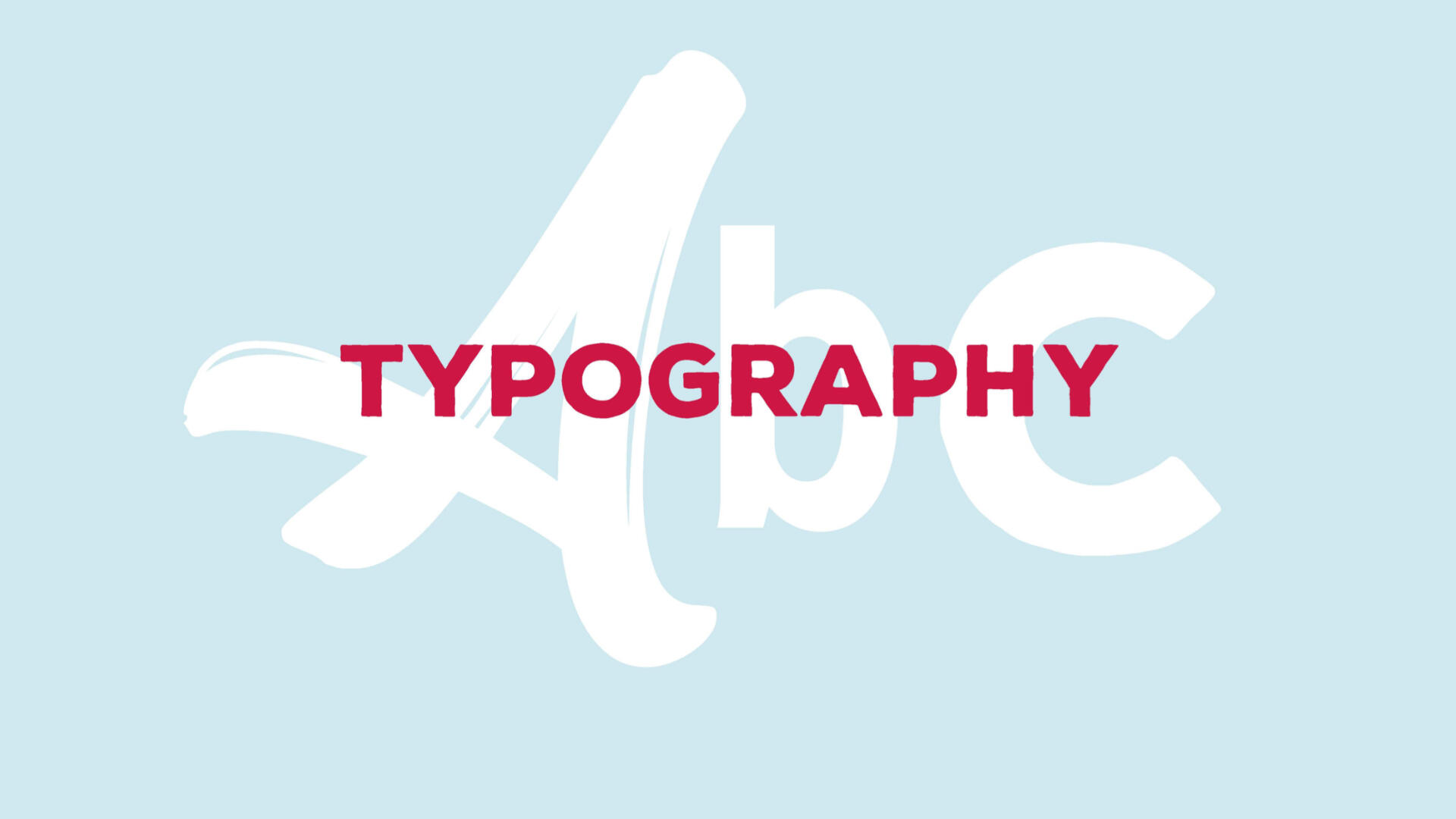
Aligning a Brand
Overview
The brand had drifted over time. It showed up differently across channels, and teams didn’t have a shared understanding of what it was supposed to be. I helped bring it back into focus and gave people something they could actually use day to day.
Pain points discovered: Teams rely on designers for every “correct” file. Versions drift and work stalls. Assets scatter across channels. Designers become the delivery system. Duplicates multiply. No one knows which file is the file.
Background
Grocery Outlet had grown to over 500 stores, and with that growth came fragmentation. Messaging, visuals, and execution varied widely depending on the team or channel.The Challenge
The issue wasn’t just visual inconsistency. It was a lack of alignment around what the brand stood for and how it should show up. Without that clarity, it was difficult to maintain consistency across the organization.Approach
I started by bringing key stakeholders together to align on purpose and direction. Working with leadership across marketing and communications, I facilitated a brand alignment workshop to get everyone on the same page.From there, we clarified the core personality of the brand and translated that into updated visuals, messaging, and guidelines that teams could actually work from.At the same time, I addressed how the work was being used. I helped connect scattered tools and assets into more accessible libraries and began laying the groundwork for a more unified system, even within existing constraints.
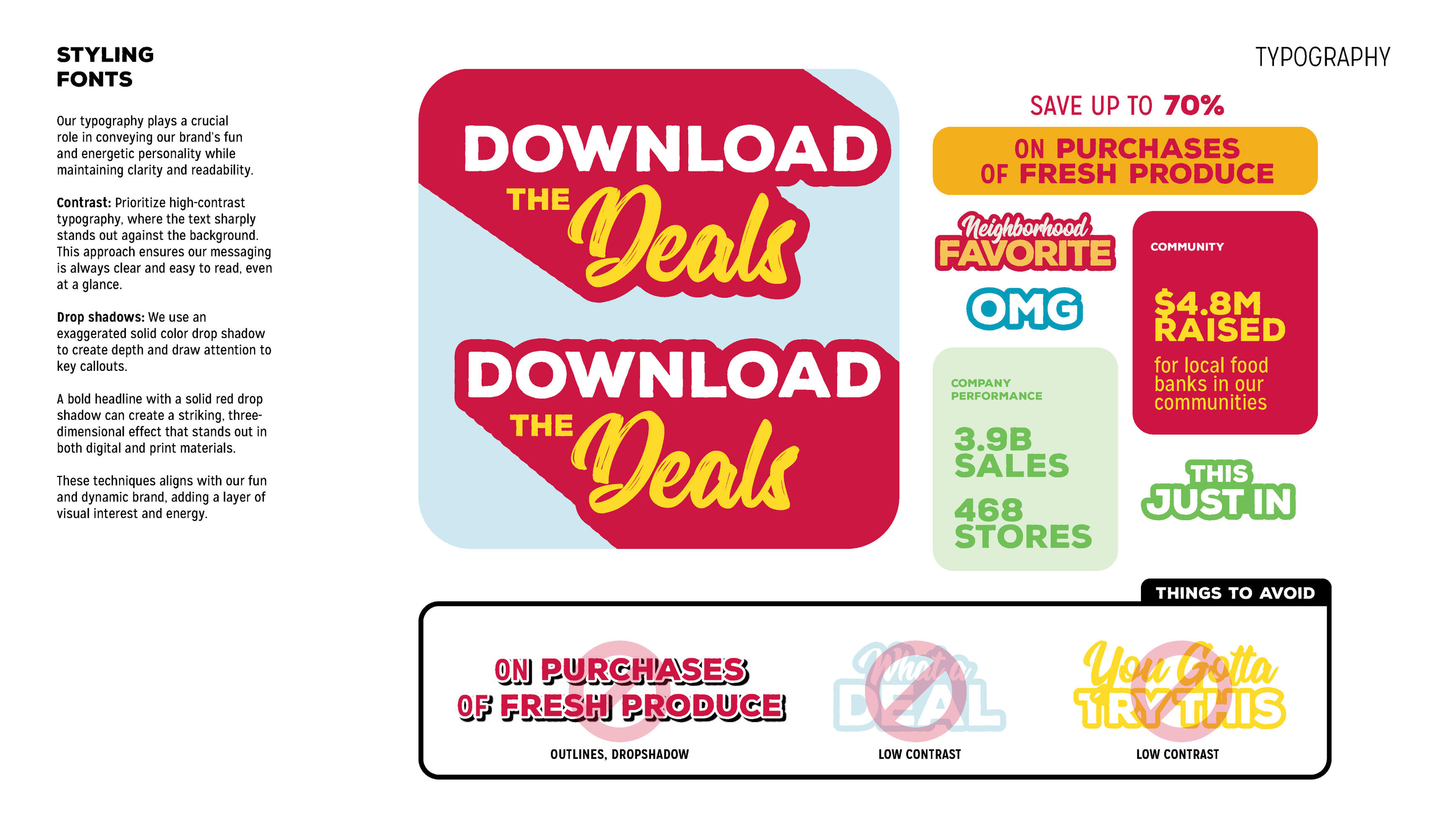
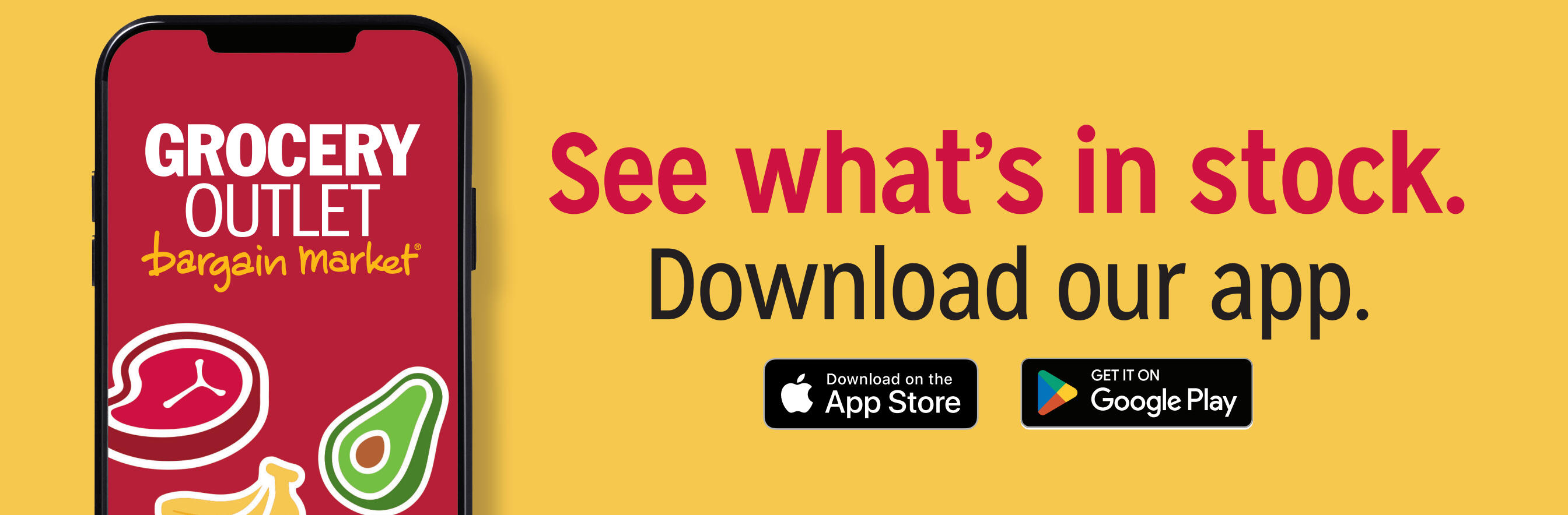
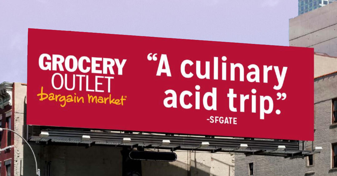
Snapshots of the brand guidelines I put together, mixed with real world creative.
Outcomes
The refreshed direction helped improve engagement, including a significant lift in social performance. More importantly, teams had clearer guidance and tools, which led to more consistent and confident execution across channels.
The work also set the foundation for more scalable systems, including shared asset libraries and future DAM planning.Takeaway
Brands don’t usually break all at once. They drift. It's not about starting over. It’s about helping people understand what the brand is and giving them the tools to use it consistently.
Great work follows.
Whether you’re building a brand, growing a team, or looking for fresh creative perspective, I’d love to help make your next project even better.
David Fernandez
Creative Lead
Creative Assets System
Overview
As the company grew, creative assets ended up everywhere. People weren’t sure where to find things, and I became the go-to person for tracking down logos, templates, and files. Instead of waiting for a formal solution, I pulled together what we had and made it usable.Background
With over 500 stores and increasing campaign volume, the amount of creative work expanded quickly. Files were spread across multiple tools and folders with no clear structure or naming standards.The Challenge
There was no single source of truth. No consistent way to organize or retrieve assets. Leadership understood the problem but hadn’t committed to a formal DAM, which left teams working around the issue day to day.
Pain points discovered: Teams rely on designers for every “correct” file. Versions drift and work stalls. Assets scatter across channels. Designers become the delivery system. Duplicates multiply. No one knows which file is the file.
Approach
I worked within the tools already in place and focused on making them more usable.I created a more predictable folder structure in Box so teams could find assets without relying on tribal knowledge. I worked with designers and marketers to establish naming conventions that made files easier to search and understand.I organized reusable elements in Adobe Libraries and Canva, making it easier to build new work without starting from scratch. I also created a simple intranet landing page to guide teams to the right tools and resources.It wasn’t a perfect system, but it connected the pieces in a way that made sense for how people actually worked.
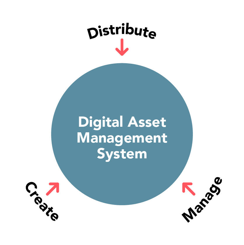
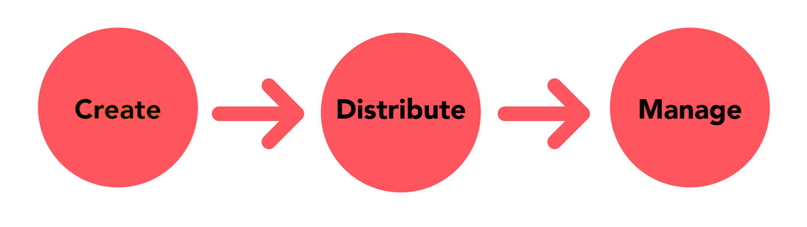
With a DAM, all are routed into one system built to store, serve, and keep the brand clean.
Outcomes
Teams spent less time searching for files and less time recreating work that already existed. Campaign rollouts became more consistent, and access to assets improved across departments and stores. It reinforced the need for a formal DAM by showing what even a lightweight system could unlock.Takeaway
You don’t need perfect tools to improve how a team works. You need something clear enough that people can use it without thinking twice.
Great work follows.
Whether you’re building a brand, growing a team, or looking for fresh creative perspective, I’d love to help make your next project even better.
David Fernandez
Creative Lead
Production at Scale
Overview
A constant flow of campaigns, shifting priorities, and a small team trying to keep everything moving in the type of environment I've spent some time in. I focused on getting the work out the door while quietly making it easier for the team to manage as things scaled.
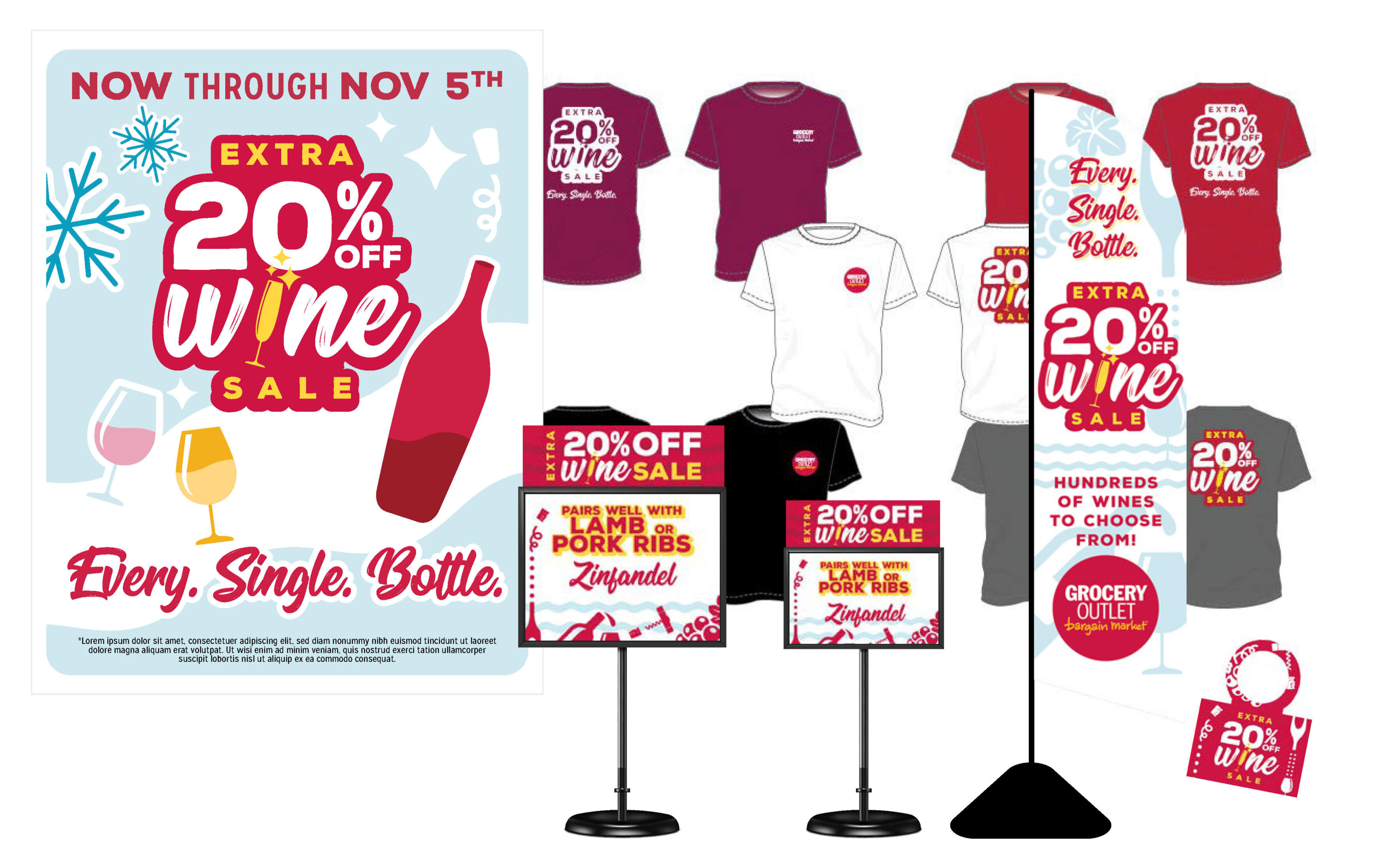
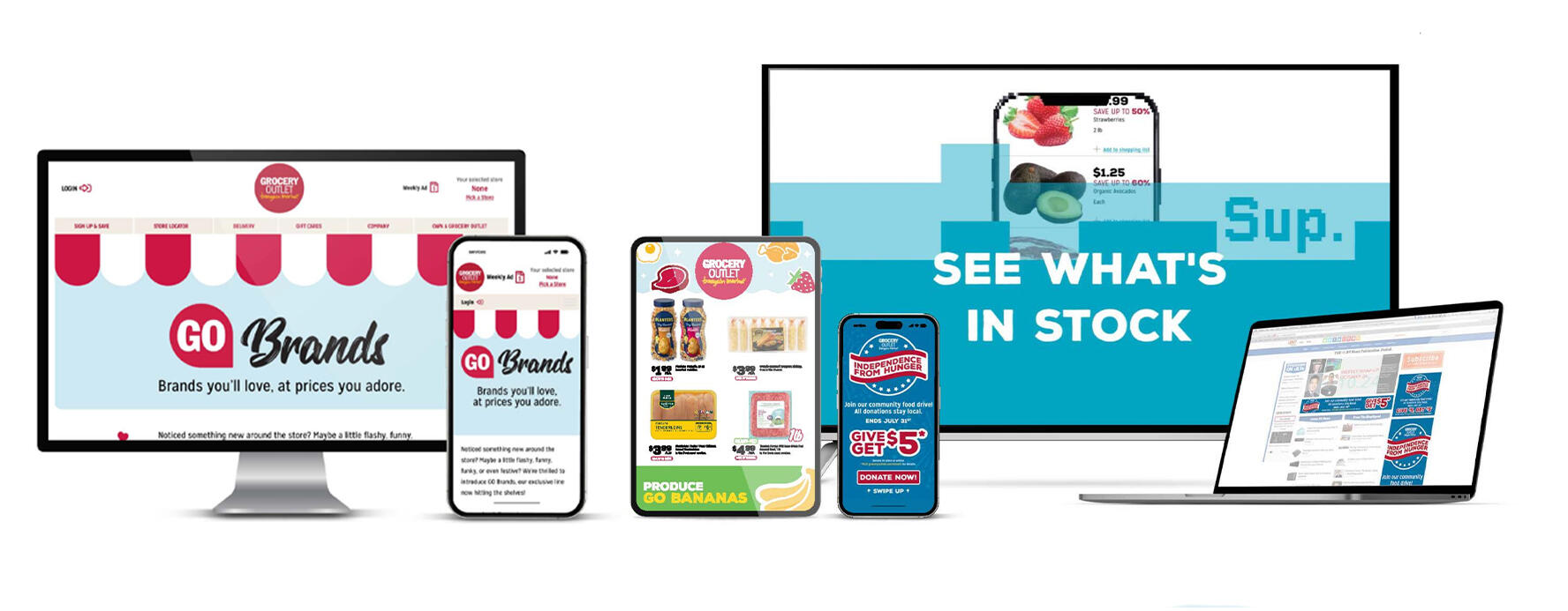
A campaign system is designed to carry through digital, in-store, radio and TV touch points.
Background
Grocery Outlet operates across hundreds of independently run stores, each with local needs layered on top of national campaigns. Over time, campaign production became a continuous system, supporting everything from seasonal promotions to digital campaigns, store-specific needs, and internal initiatives.I experienced this from both sides, first as an individual contributor handling production, then as a manager responsible for output, quality, and team health as complexity increased.The Challenge
The work was highly reactive. Priorities shifted late, ownership wasn’t always clear, and a small design team supported a large organization. Design often absorbed the pressure, expected to deliver consistent, on-brand work across channels despite ambiguity and urgency.As the company grew, the risk wasn’t just inefficiency. It was burnout, misalignment, and a fragmented customer experience.
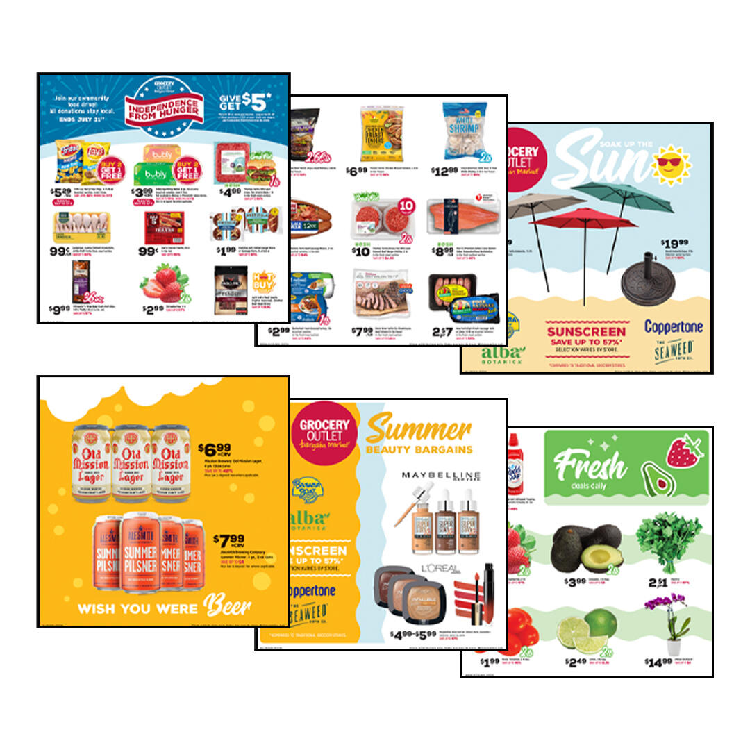
Leaning on typography and templates allowed us to move quickly.
Approach
I didn’t wait for things to settle. I worked inside the pace of the work, focusing on what would help immediately while building something more stable underneath.I partnered with my director to create simple prioritization guardrails so the team could make decisions without constantly renegotiating priorities. Campaigns with broader impact and fixed deadlines came first, which gave us a shared way to navigate last-minute changes.I built direct relationships with buyers to better understand their goals and timing. That context helped reduce surprises and allowed us to prepare for recurring needs instead of reacting every time.Where tools or systems were missing, I filled the gaps with what we had. I organized shared folders, created accessible campaign assets for stores, and built lightweight libraries that made it easier for teams to find and use what they needed.
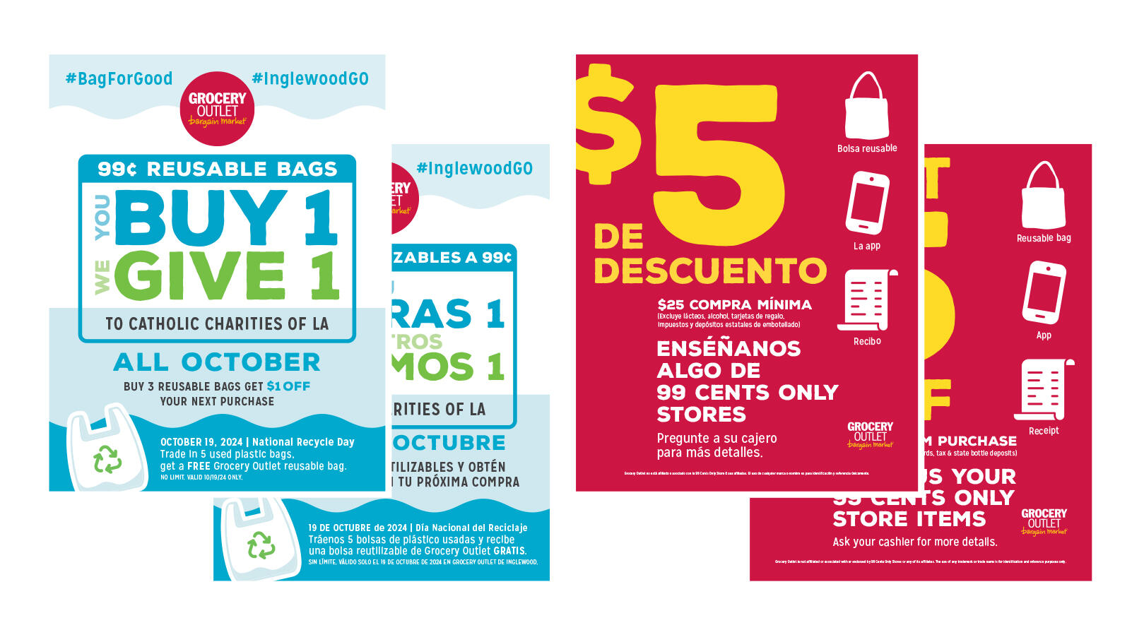
I also developed templates across Adobe and Canva to support different skill levels, giving marketers and store teams the ability to move faster without going off-brand.Along the way, I helped formalize review and approval steps so expectations were clearer and rework was reduced.
An example of an ad version. There were often 7-8 versions needed with in-store messaging in two languages.
Outcome
The work didn’t become simple, but it became more manageable.Teams had clearer ways to prioritize, better access to assets, and more confidence in what they were producing. Brand consistency improved across most stores while still allowing for local flexibility. Rework decreased, and collaboration across teams felt more aligned.Most importantly, having things in place created space. Space to respond, to support stores, and to keep the human side of the work intact.Takeaway
When things are moving fast and not fully defined, I help teams get through what’s in front of them while setting things up so it’s easier next time.
Great work follows.
Whether you’re building a brand, growing a team, or looking for fresh creative perspective, I’d love to help make your next project even better.
David Fernandez
Creative Lead
Improving the Digital Experience
Overview
The digital experience wasn’t working as expected. It felt inconsistent, harder to use than it needed to be, and didn’t fully reflect the brand. I stepped in to help make it clearer, more usable, and easier for both customers and internal teams to build on.
Background
Across web and app, the experience lacked consistency and accessibility. Different parts of the product felt disconnected, and without clear documentation, teams were often guessing or rebuilding from scratch.The Challenge
Search was missing, accessibility needed improvement, and there wasn’t a shared way of designing or building across teams. That made it harder for users to navigate and harder for teams to move efficiently.
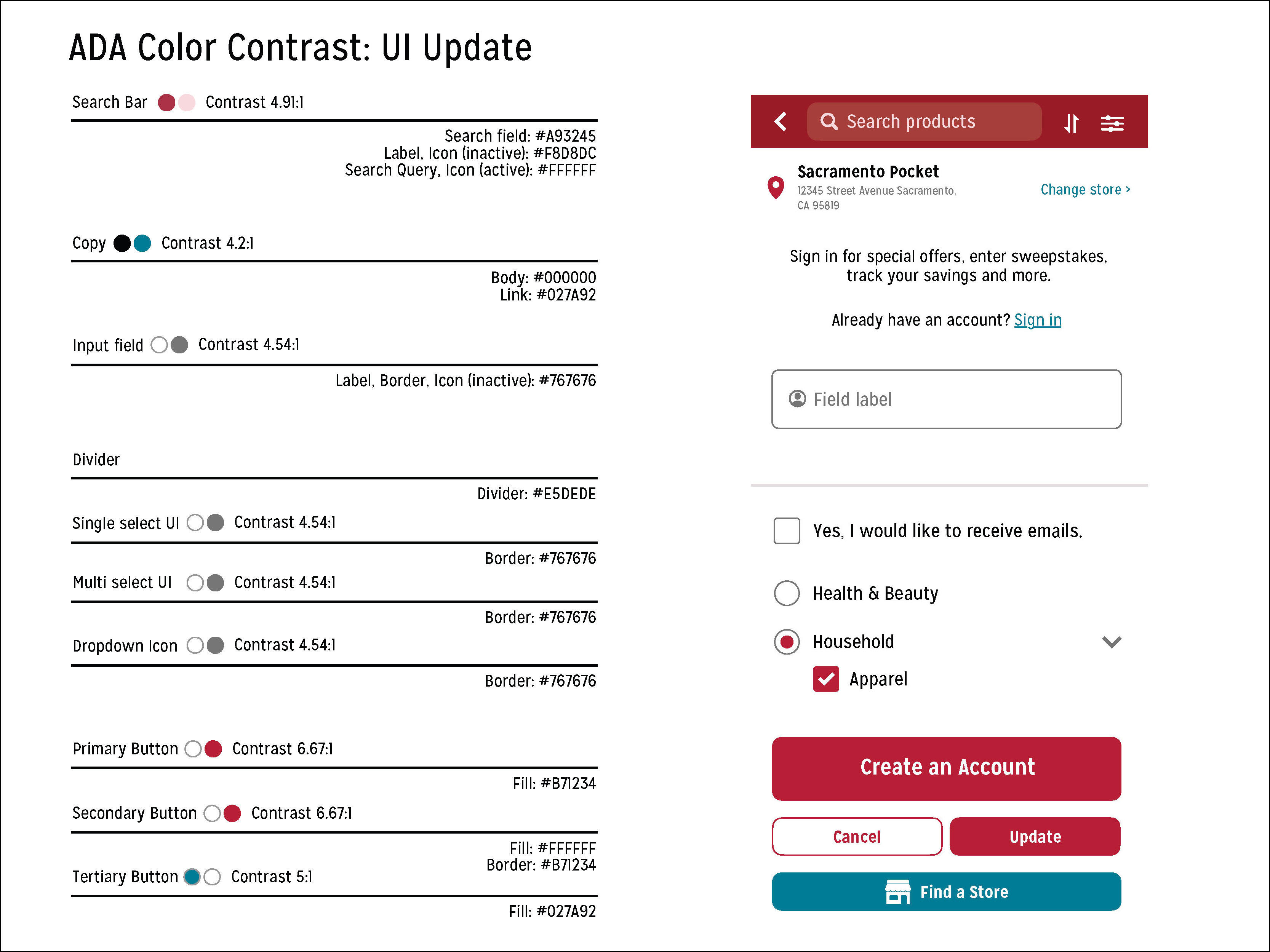
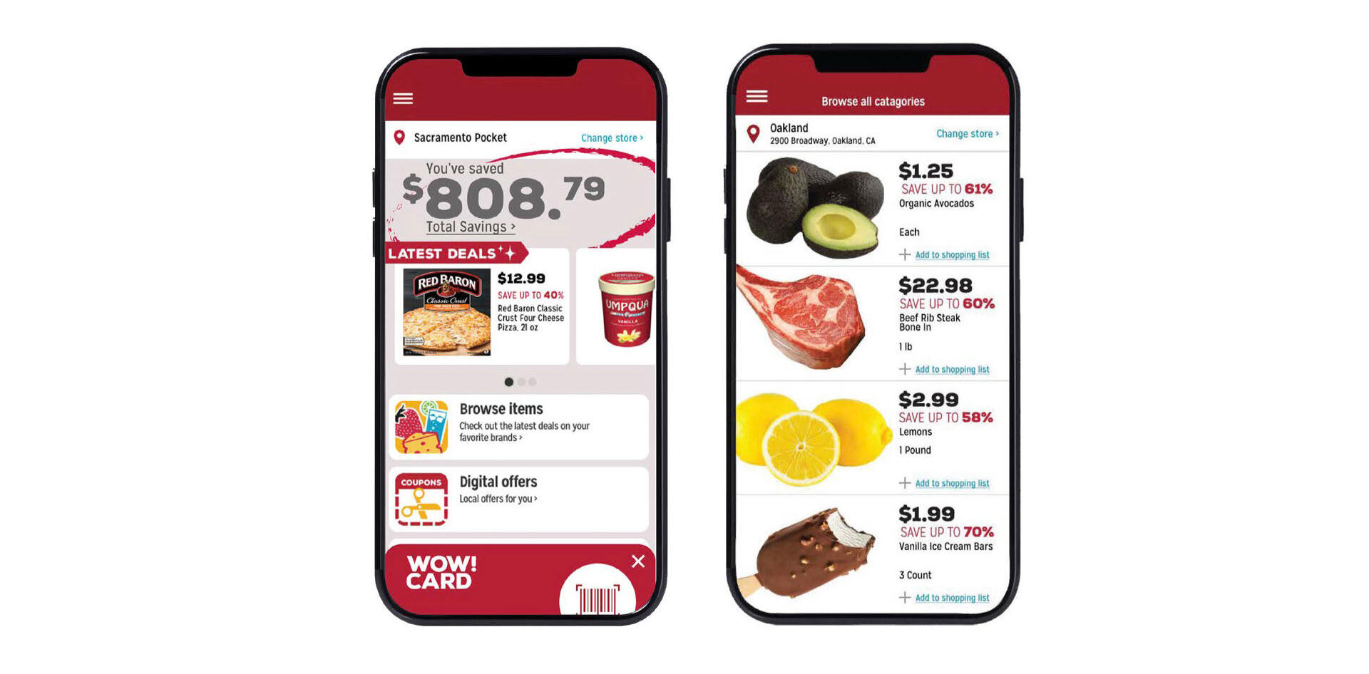
Color adjustments for the mobile app.
Approach
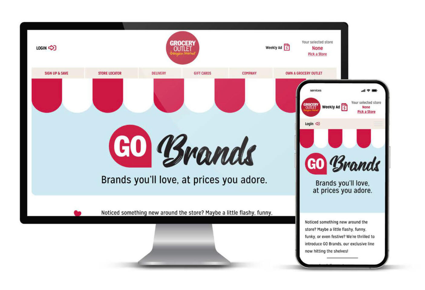
I worked directly in the product with the team, focusing on what would make the biggest difference right away while also making sure the improvements would last.I improved ADA compliance by refining contrast, typography, and interaction patterns, and documented those updates so developers could apply them consistently moving forward.At the same time, I helped shape and prototype a search feature alongside the Senior Digital Director. It was a clear gap in the experience, and adding it aligned naturally with how customers already think about browsing and discovering products.I redesigned web pages as a way to show what a more modern, cohesive experience could look like. It became a simple, tangible example of how better UX and brand alignment could work together.
Outcomes
After launch, engagement improved and the experience felt more intuitive and connected. Just as importantly, teams had clearer documentation and patterns to work from, which made future updates easier and more consistent.Takeaway
Small, focused improvements can shift the entire experience. When something is easier to use and easier to build on, everything moves and looks better.
Great work follows.
Whether you’re building a brand, growing a team, or looking for fresh creative perspective, I’d love to help make your next project even better.